
During covid-19 pandemic when there has been a surge in demand for opening a bank account online, TOSAN company has provided a process-oriented mobile bank platform for this purpose. They released face video verification as a part of the opening bank account process. It has Liveness detection and also compares your face with your photo from identity documents.
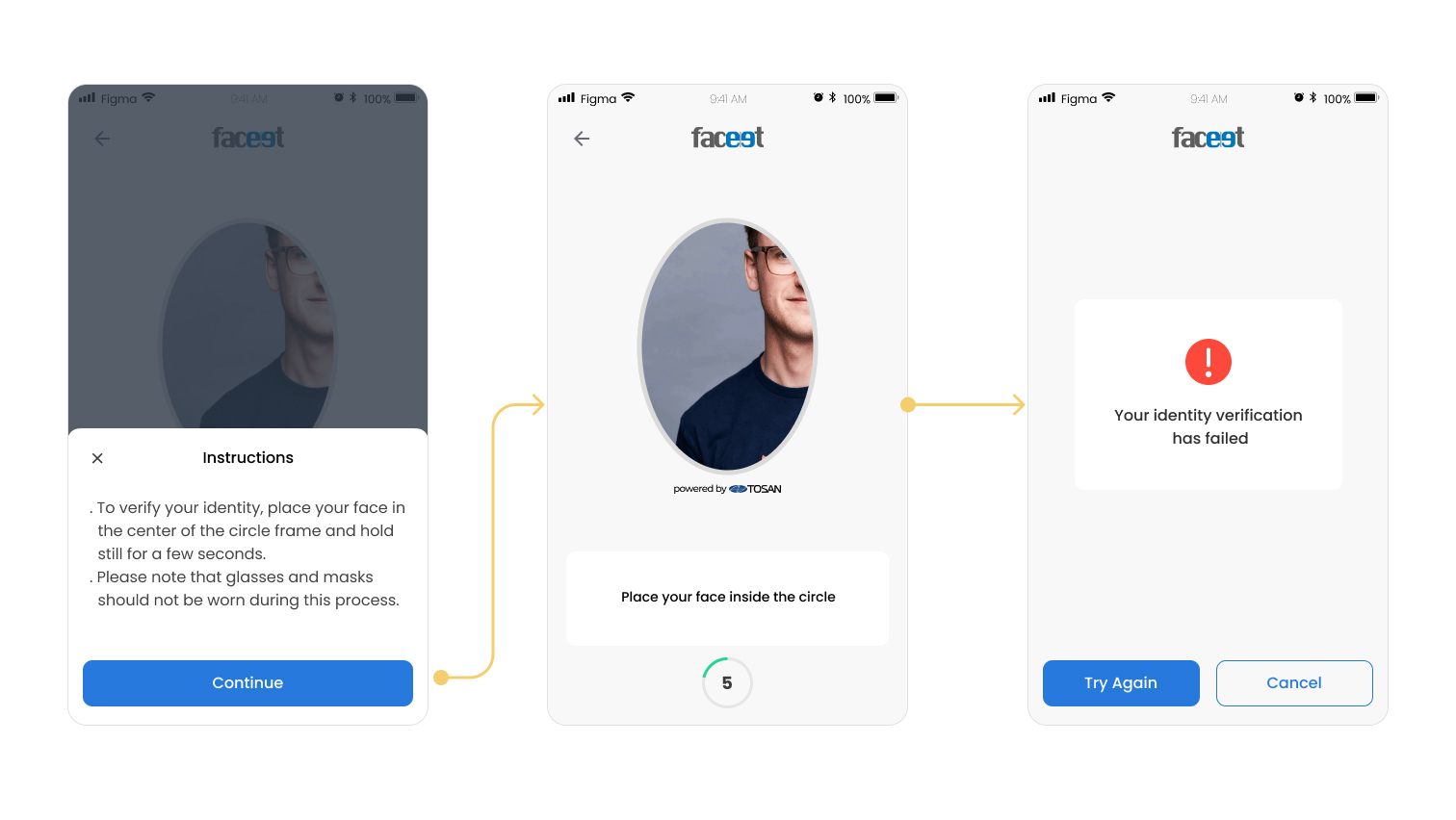
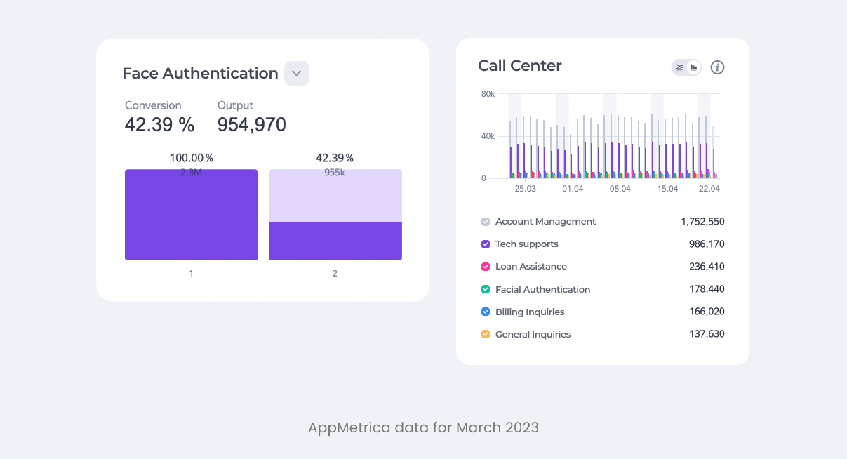
Every day around 25% of the calls to our call center were about users had problem and couldn’t verify their identity through the face verification process. Also our data revealed that conversion rate for this process was very low ~42% and most of the users drop off within the process.
Based on the number of calls and our data we decided to conduct a usability test to understand the pain points of users and identify areas for improvement.
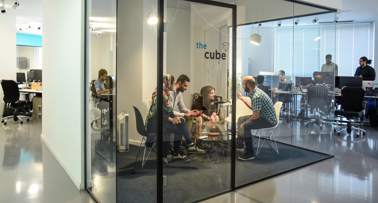
With the help of our UX research team, we conducted remote usability testing to identify user pain points and understand where users drop off during the face verification process. Observations, feedback, task completion times, and dropout points were recorded during the test.
Based on the findings from usability test, the following design solutions were implemented :
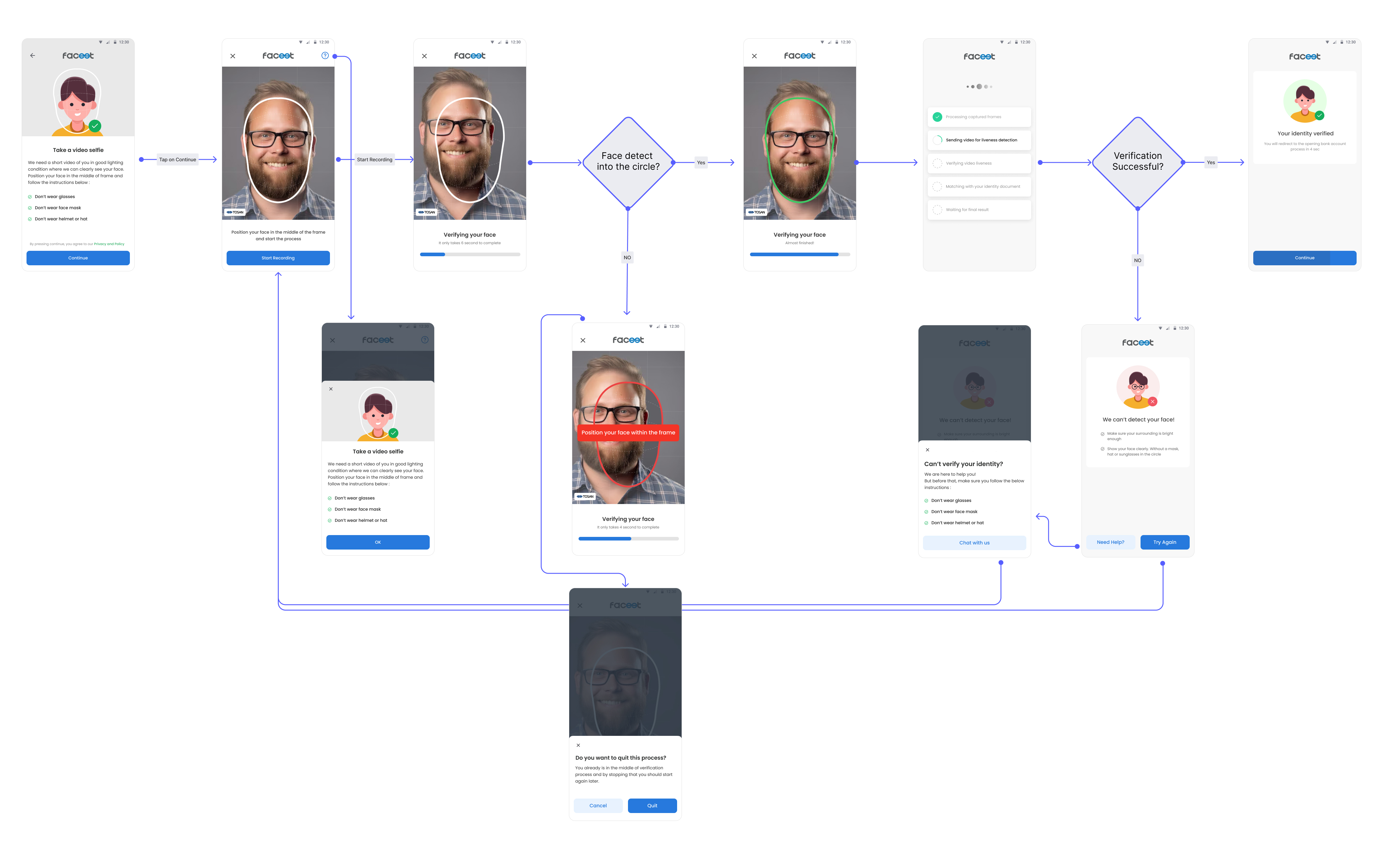
We know our users ignore the current help bottom sheet and didn’t read the instruction. I wanted to grab users’ attention to the possible failure reasons before the verification process. I used illustrations to convey information effectively and create a visually engaging experience. Also, I put the help button on other pages as well, in case of missing at the beginning of the process.

In collaboration with the development team, I put a 'Start' button at the beginning of the verification process to allow users to initiate the process at their convenience. Additionally, we extended the process duration time to ensure that users have enough time to fix their face in the frame and also enhancing user comfort and ease of use. Furthermore, I redesigned the circular frame to increase user accuracy.
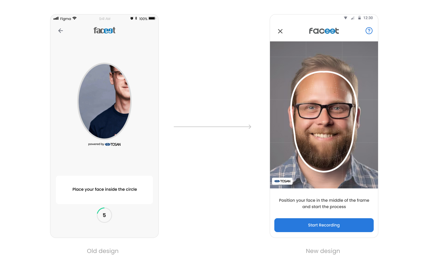
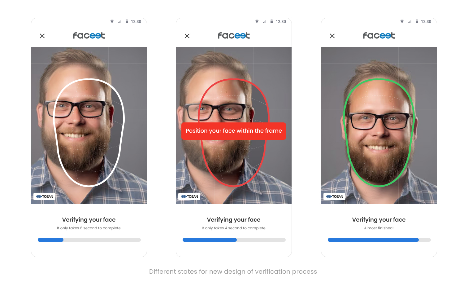
Users were unaware of the state of their progress and missed the live hints and feedback. To address this, in collaboration with development team, we implemented green and red colors universally recognized as indicators of status. Additionally, I positioned hints at the center of the circle rather than the bottom of the page, ensuring users who focused on the circle could easily read them without distraction or the need for eye movement.
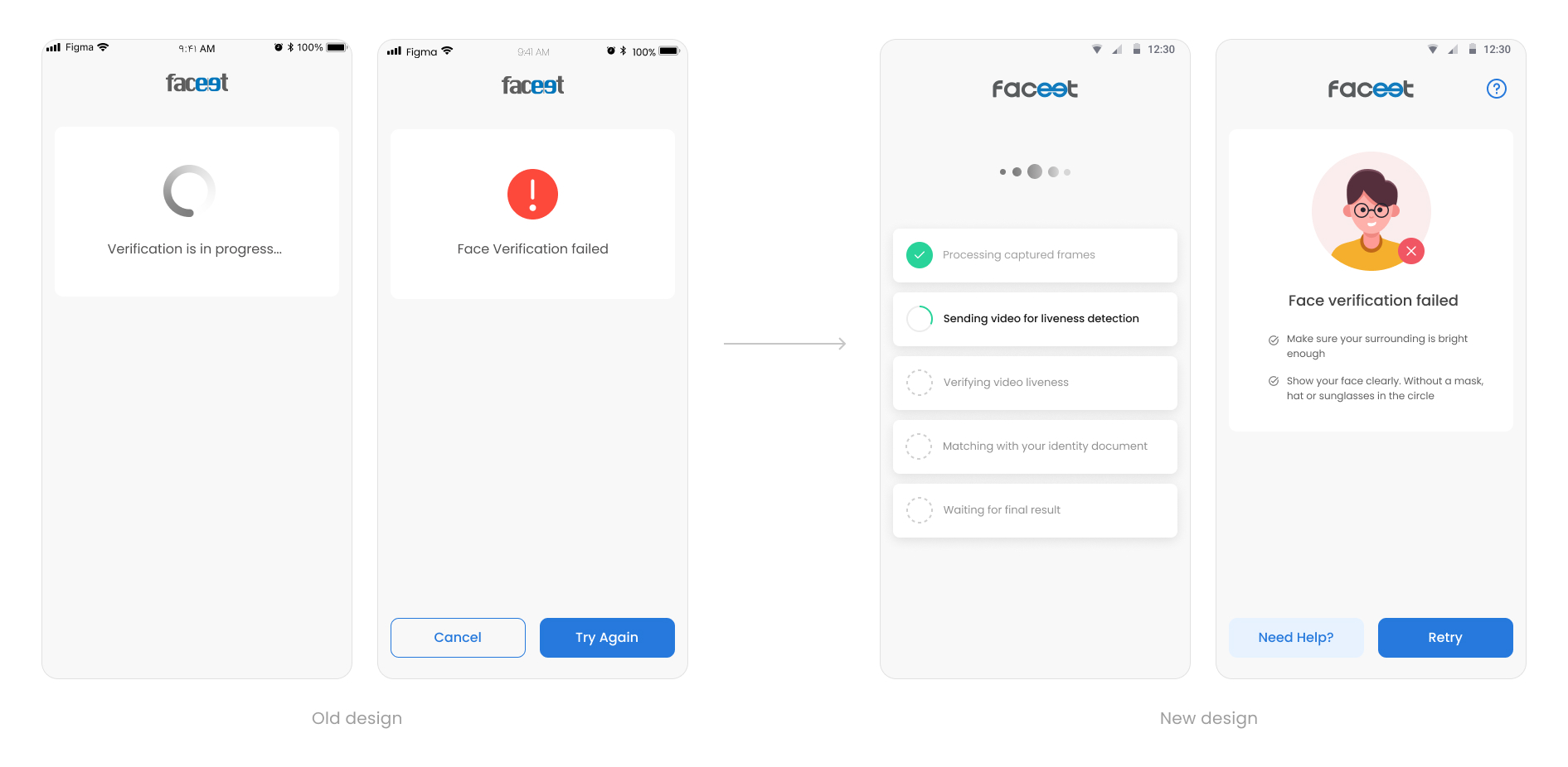
Sometimes poor internet connection caused delays in completing the validation process. To keep users informed during this time, I replaced the basic loading indicator with a progress loading animation, indicating that validation is underway. Additionally, in case of failure, I included potential reasons for the issue, along with suggested solutions, empowering users to retry with confidence.
After several feedback sessions with the UX team, PM, and engineers, We selected the following version as the final design. However, it was time to test them again to make sure these improvements addressed the user’s pain points properly.
We are going to conduct accessibility testing to validate compliance with accessibility standards and ensure that the design improvements are inclusive and usable by all individuals, including those with disabilities or impairments.


