Recently I’ve been collaborating with Nihito, a Swiss startup, to design a SaaS platform from scrach that turns Python scripts into shareable web apps with ready-made UIs. As the lead product designer, I was responsible for the core flows, interfaces and design system, ensuring the experience is simple, trustworthy, and scalable.
Designing Nihito meant working at the intersection of highly technical backend logic and users who are not necessarily tech-savvy. Here’s how I approached it:
I approached this project with a structured design process, moving step by step from understanding users to building and testing the product
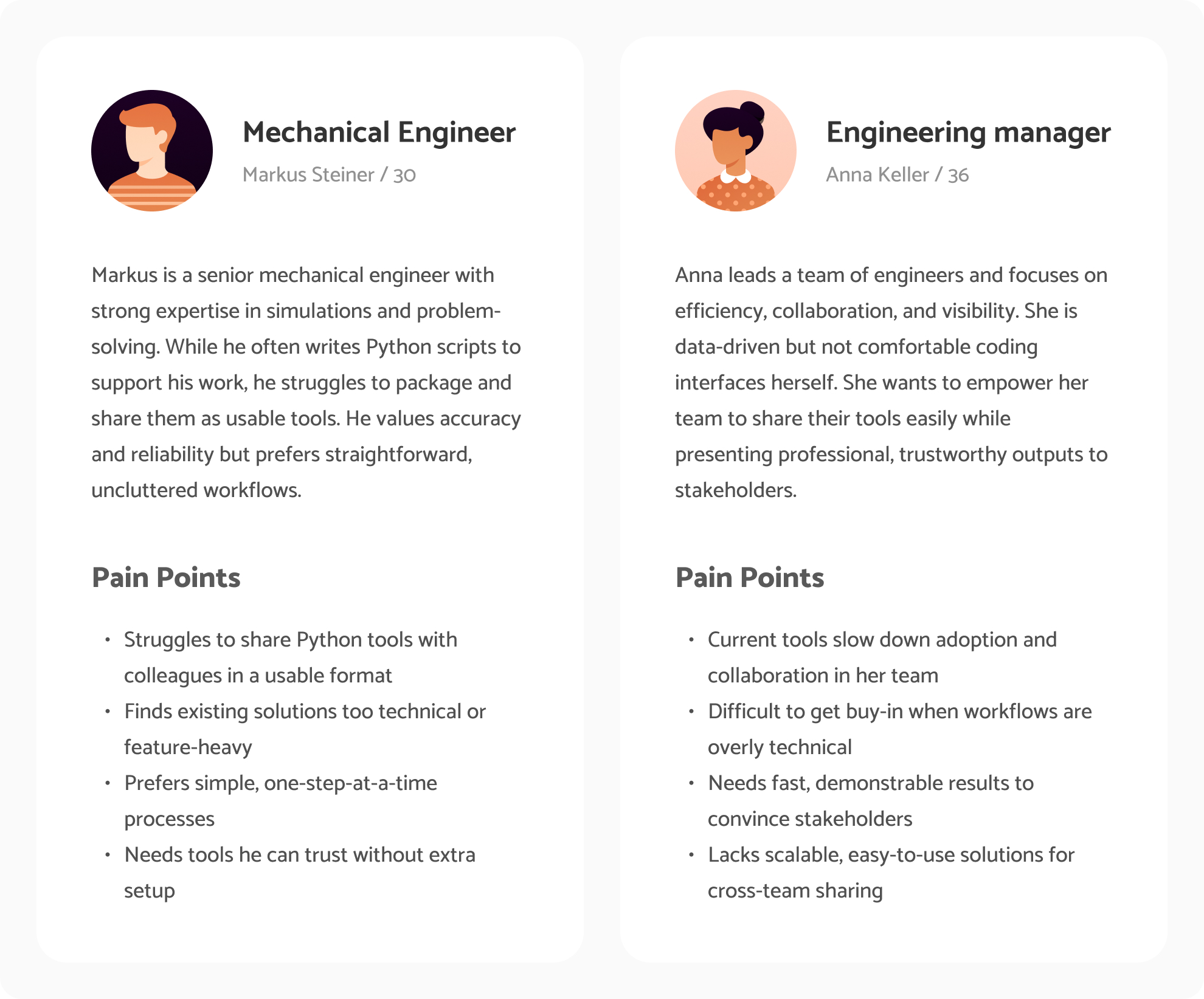
Before designing, I needed to understand who the users are, their challenges, and what truly matters to them. Since mechanical engineers are often not tech-savvy and prefer clarity over advanced features, I created personas and mapped frustrations to uncover real obstacles. This helped me set design goals around simplicity, usability, and trust.
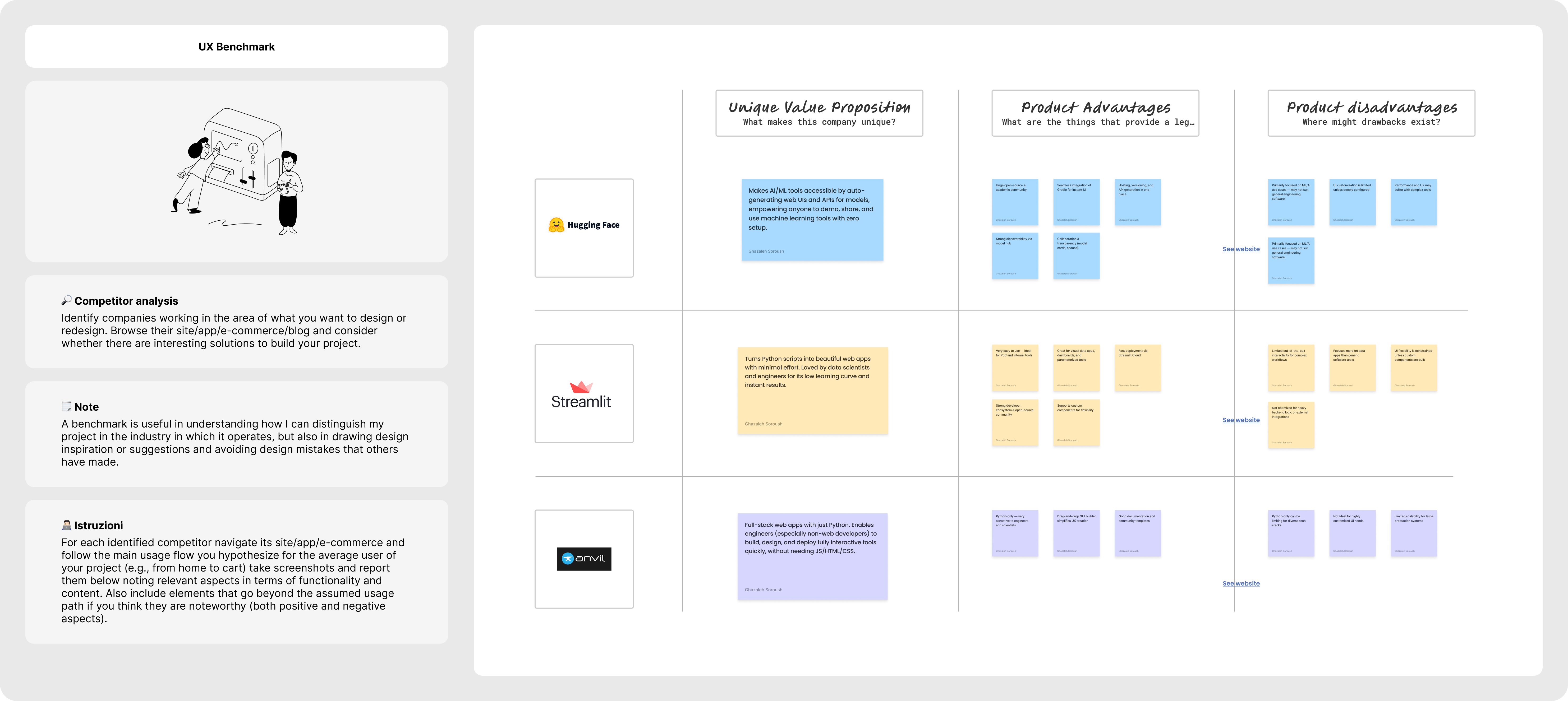
I explored platforms like Streamlit, Gradio, and Anvil to see how they approached similar problems. While powerful, they often required coding UIs or managing hosting that are barriers for engineers who just want things to work.
This confirmed our design direction: focus on clarity, zero-code flows, and simple step-by-step guidance.
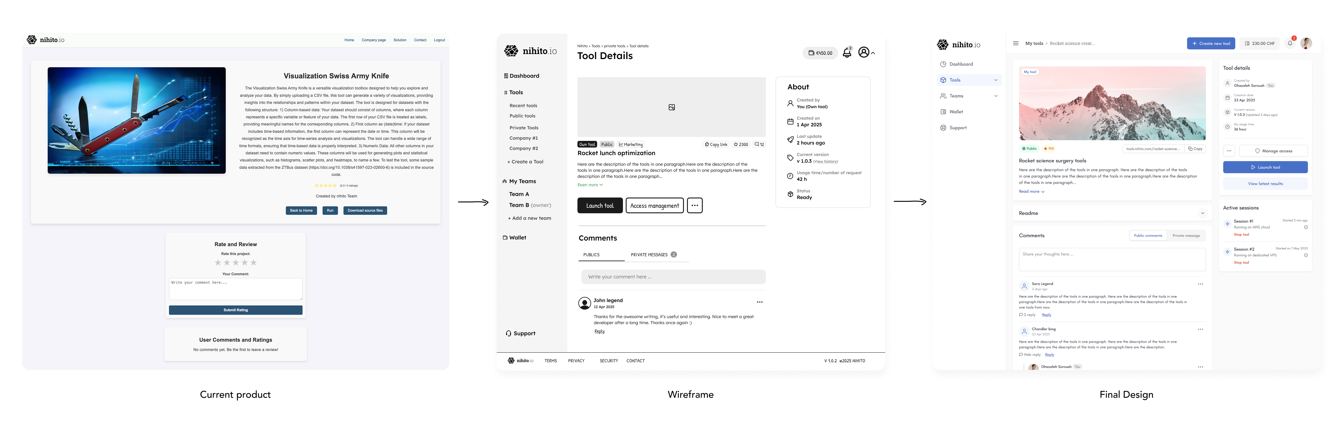
At this stage, I focused on mapping the user flow and sketching early wireframes. I worked side by side with the founders in multiple sessions, iterating on ideas, testing assumptions, and making changes until the journey felt clear and simple.
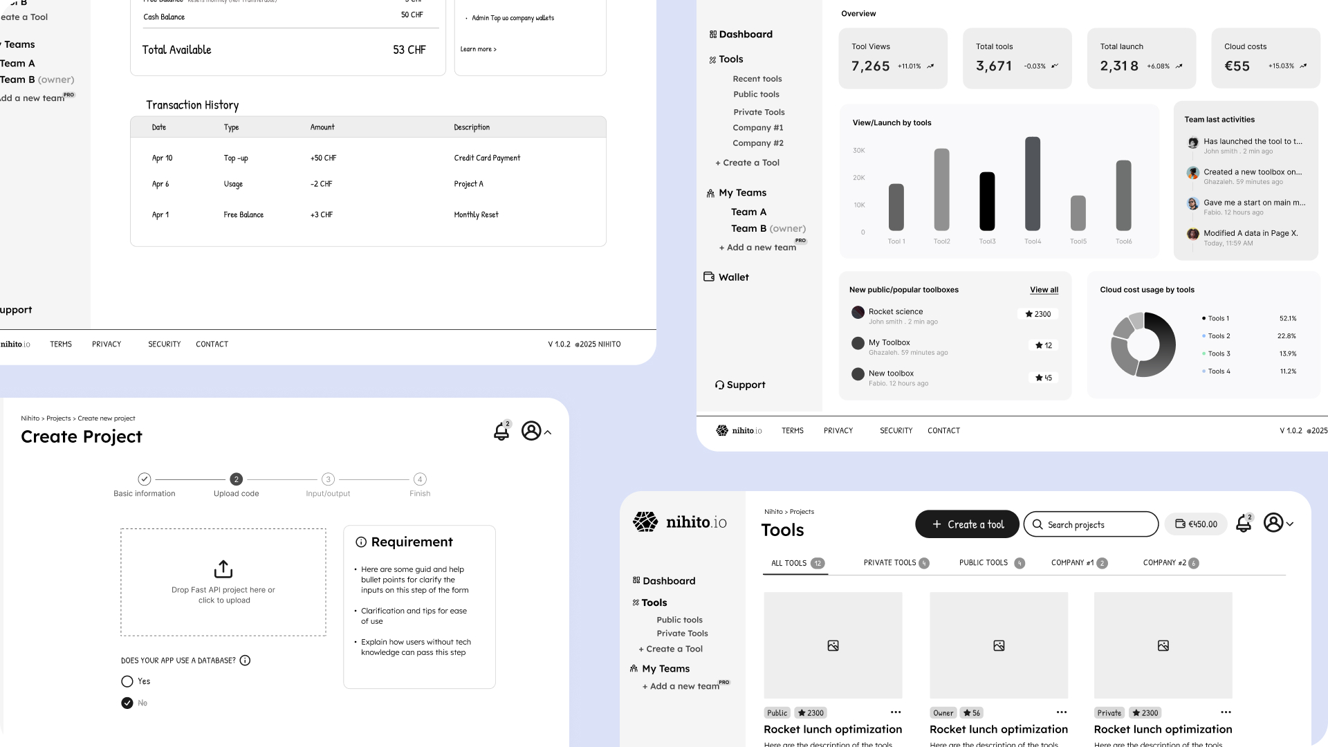
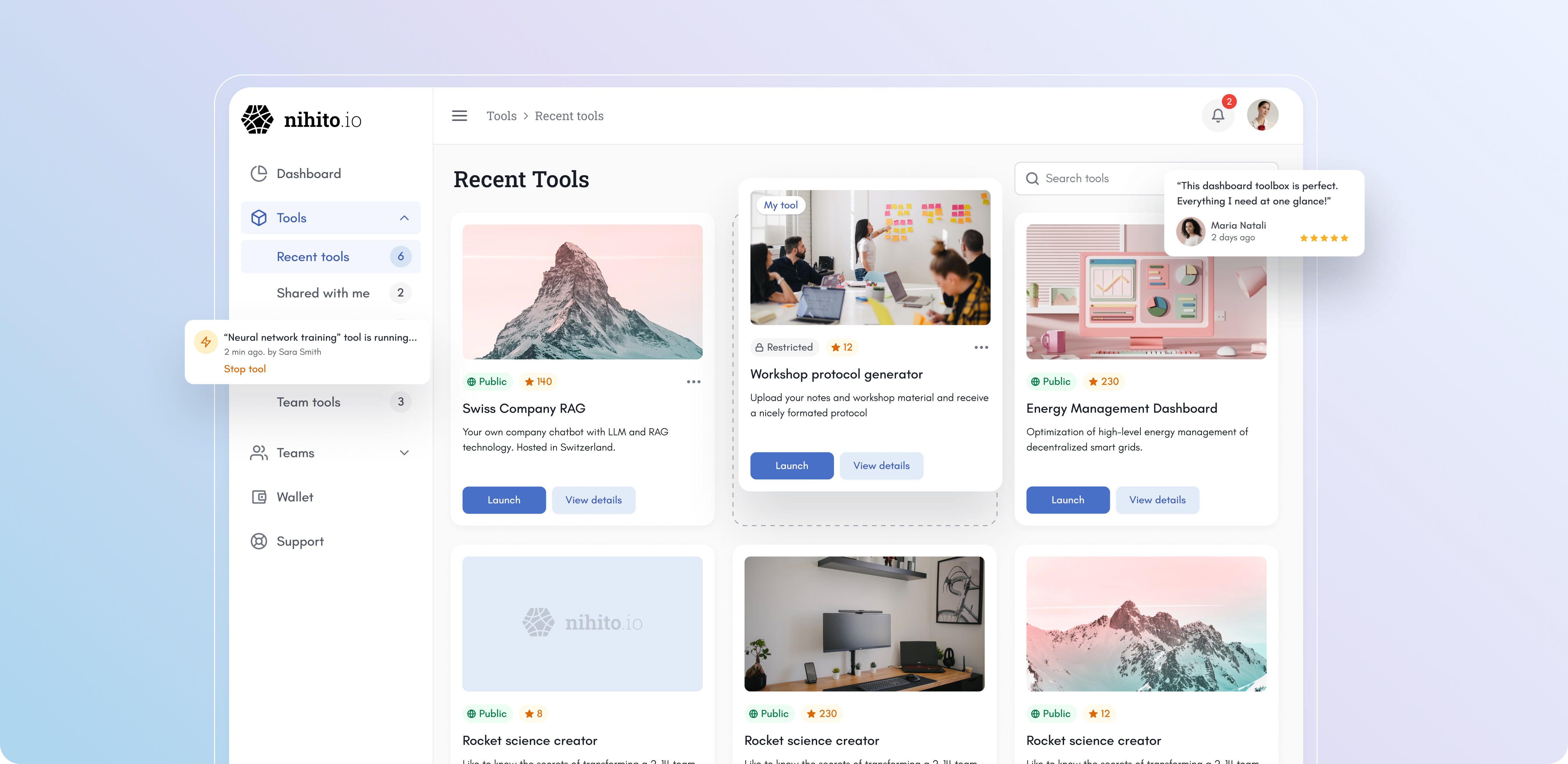
When moving from wireframes to UI, I focused on an MVP mindset: keeping screens simple, guiding users step by step, and delivering the core value without unnecessary features. To keep the design consistent and efficient, I built a basic design system in parallel — buttons, inputs, alerts, typography, etc.
As I designed new screens, the system evolved, each iteration added or refined components, ensuring the interface stayed cohesive, scalable, and easy to implement. This approach gave me both speed in design and a solid foundation for the development team.
As I designed and shared work with founders and developers, new edge cases and scenarios emerged that we hadn’t considered earlier. Some flows had to be rethought based on backend constraints, while the founders also refined parts of the product logic during our sessions.
Instead of sticking rigidly to initial designs, I stayed flexible. Adapting wireframes, updating UI, and refining components in the design system. This iterative process ensured the product stayed aligned with business needs, technical realities, and user expectations, while keeping the experience consistent and simple.

Before launch, I ran moderated usability tests with mechanical engineers to validate the web-app creation flow. I observed participants as they went through the steps of uploading a Python file, previewing the auto-generated UI, and publishing their first app.
The tests confirmed that the step-by-step process worked well, but also revealed areas to refine. Users tended to skip long instructions, so I replaced them with short guidance and tooltips. These insights helped polish the experience and gave us confidence that the product was truly usable for our audience.
We are now in the launch phase of Nihito. The focus has shifted from design validation to tracking real user behavior in the platform. We’ve integrated Microsoft Clarity to capture session replays, heatmaps, and drop-offs, which will help us understand how engineers interact with the product at scale.
Key metrics we plan to track include:
These insights will guide the next iterations, ensuring the platform continues to improve based on actual usage rather than assumptions.


