
Snapp! is known as the Uber of Iran with more than 2 million rides per day and 60 million users. The company is the largest and fastest growing internet company in the Middle East.
The Scheduled Rides feature allows you to book a ride in advance by selecting your pickup time and offering convenience and peace of mind, especially for important appointments or events. However, user research revealed several challenges and areas for improvement within this feature.
As a Product Designer, my role went beyond just crafting visuals. I collaborated closely with UX writers, product managers, the design system team, and UX researchers. By guiding our collective efforts, we combined user insights, content clarity, and design consistency to shape a seamless experience for Snapp's users, ensuring that every team’s expertise was reflected in the final solution.
After rolling out this feature, the analysis showed that the cancelation rate was more than 45% before accept by driver which is high. This problem raised from product managers and I decided to understand the underlying reasons for this behavior in order to develop a better solution.

With the help of UX research team, we conducted quantitative online surveys to discover the reasons behind this problem.
Although that the UX research team was responsible for entire research process, I was participate in all the steps from research plan, choosing methods to the final insights. Our research goal was searching for answers to these questions :
1. Can users understand the "Scheduled Ride" feature?
2. What causes passengers to cancel scheduled rides?

Snapp is a user base product and using quantitative survey allows us to collect measurable data from a large number of users (About 600 users in this survey) which is more reliable rather than qualitative methods. Also, users can complete the survey at their convenience which leads to higher response rates with benefit of lower cost and faster data collection!
This research revealed that there has been a lack of promotion and education regarding the feature, which ultimately leads to user dissatisfaction and cancellation of the service.
1. 40% of the users were unable to understand the purpose of the feature.
2. 22% of the users submit their request out of curiosity!
3. 28% of users didn’t know about the driver arrival or delay terms and conditions.

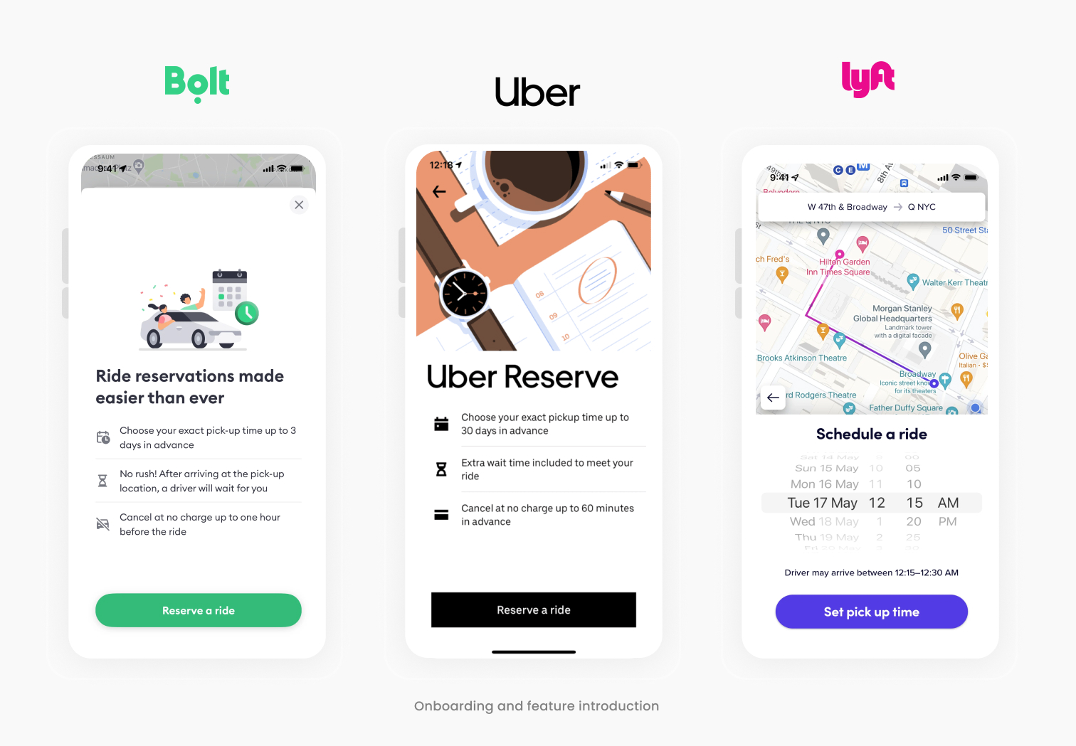
At first, I benchmarked competitors and different ride-hailing apps (such as Uber, Lyft, Bolt, etc) to understand how we can introduce our schedule rides feature and improve on the current design and where it falls compared to competitors.
In the early stages of conceptualizing the improvements, I invited one member from each team include product manager and developer to engage in dynamic brainstorming session. These session were fueled by creativity and collaboration, as we explored various ideas to enhance the user experience and user clarification. Throughout this brainstorming session, sketches played a pivotal role in visualizing my concepts and refining my ideas.

Based on the findings from user research and benchmarking, the following design solutions were implemented :
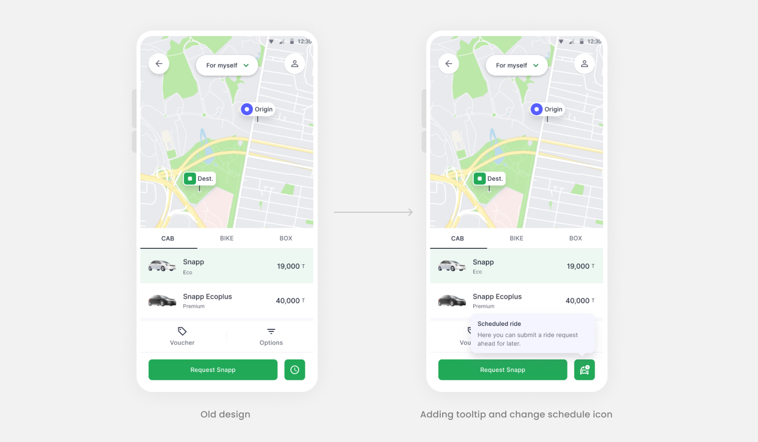
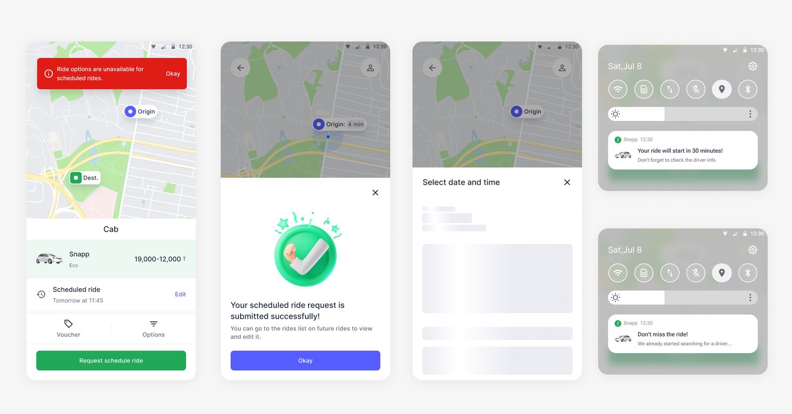
Based on one of the UX research findings about lack of clarity and education, I added a tooltip to explain what’s this feature about and increase awareness. I also changed the schedule ride icon (based on benchmarks) combination of time and car for more clarification.
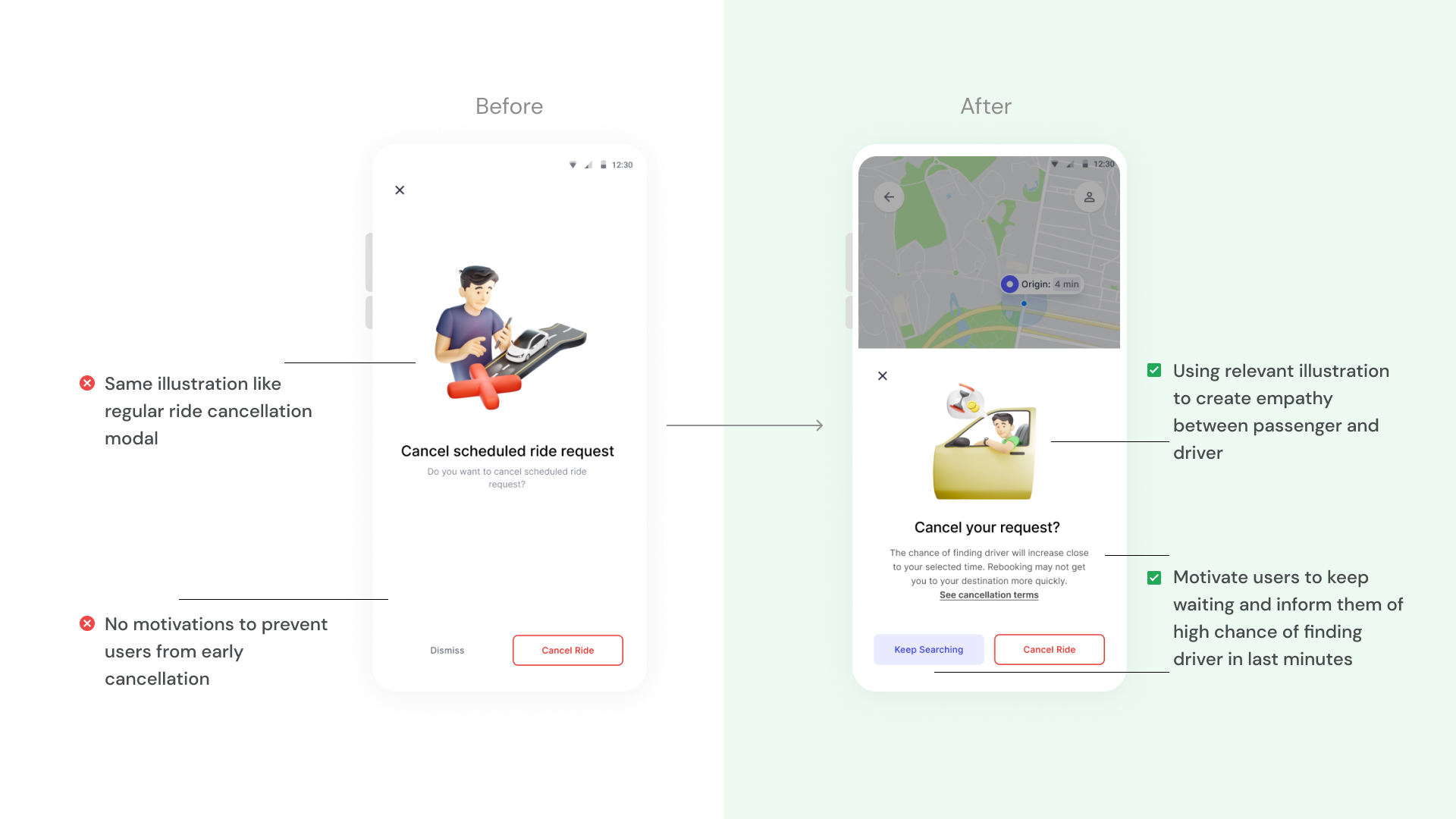
I added a related illustration to grab user attention and make this page more enjoyable for user. Based on the fact "Users scan!", I highlight some important key notes with the help of UX writer and using visual hierarchy rather than showing too much text to increase readability.I wanted to make sure users understood the feature very well and reduce the requests out of curiosity.

We have a rule that user can schedule a ride for at least 15 minutes ahead of current time and currently we let user to select the past or wrong time. I checked the error rates in this page on Clarity monitoring tools and find out around 45% of users face an error in this page. So base on the best practices in collaboration with technical team, I decided to show the next possible time to users and prevent users from selecting the wrong time by disabling them.Also I informed user about driver delay average time in this modal because it helps them to select more accurate pickup time.

One of the problems with the previous design was that we didn’t prevent users from early cancellation before the driver was found. In new design, I informed users about the high chance of finding driver close to the selected time to persuade users to wait for driver instead of cancel the ride. Also I tried to use new illustration and "keep searching" button label to create empathy between driver and passenger.
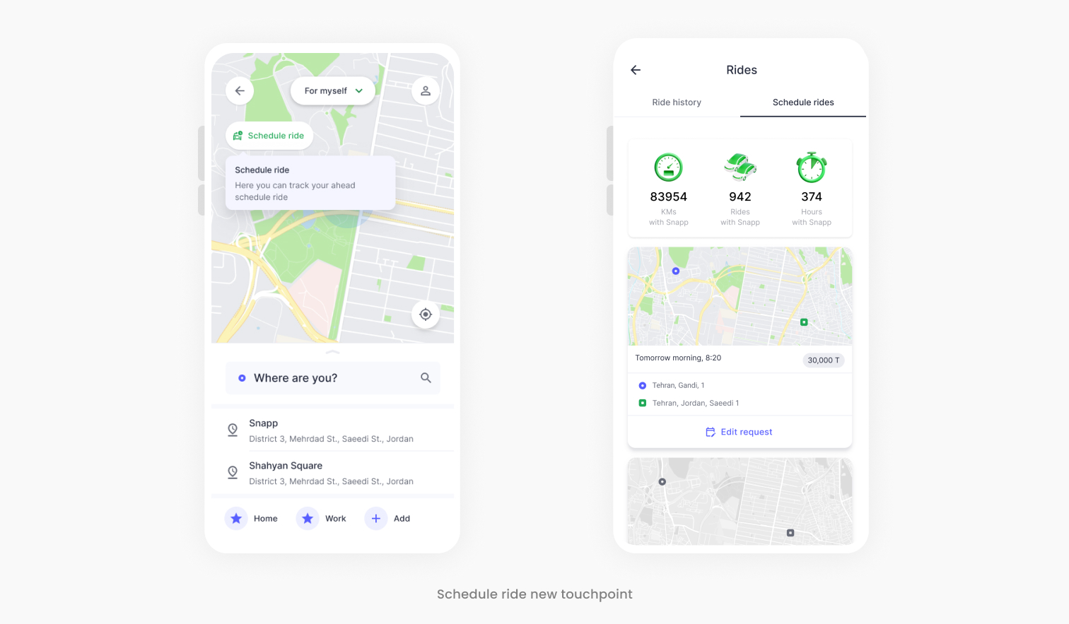
I designed a dedicated touchpoint on the homepage for tracking upcoming scheduled rides. Users can effortlessly access and manage/edit upcoming bookings without navigating through multiple screens. This enhancement simplifies the process of locating scheduled rides and boosting feature find-ability.
After some design meetings with product team and iterations, I deliver the design improvements to the development team in the flow and consider all the states and conditions like error states, success messages, notifications and loadings.
We rolled out these design changes for a limited percentage of users to monitor the impacts and metrics and evaluate our design decisions. We compared the new data with previous one and figured out there are lots of improvements on Cancellation rate and Conversion rate.
.jpeg)
Due to the short deadline, lack of time and new business strategy on that time, I wasn't able to conduct usability testing or gather feedback directly from users. I have discussed this with the product manager and we plan to conduct a qualitative test to address possible usability issues in the next quarter.
People from different cultures have different thinking styles, values, perceptions, behaviors, and cognition. In the beginning, when we design schedule ride feature, our assumption was it's crystal clear for users so it doesn't need any guide or help regarding to usage of this feature. But user research revealed,
"when you don't have any similar competitors for your users to look and learn, you should be the first one to create this foundation and you must educate your audience!"


